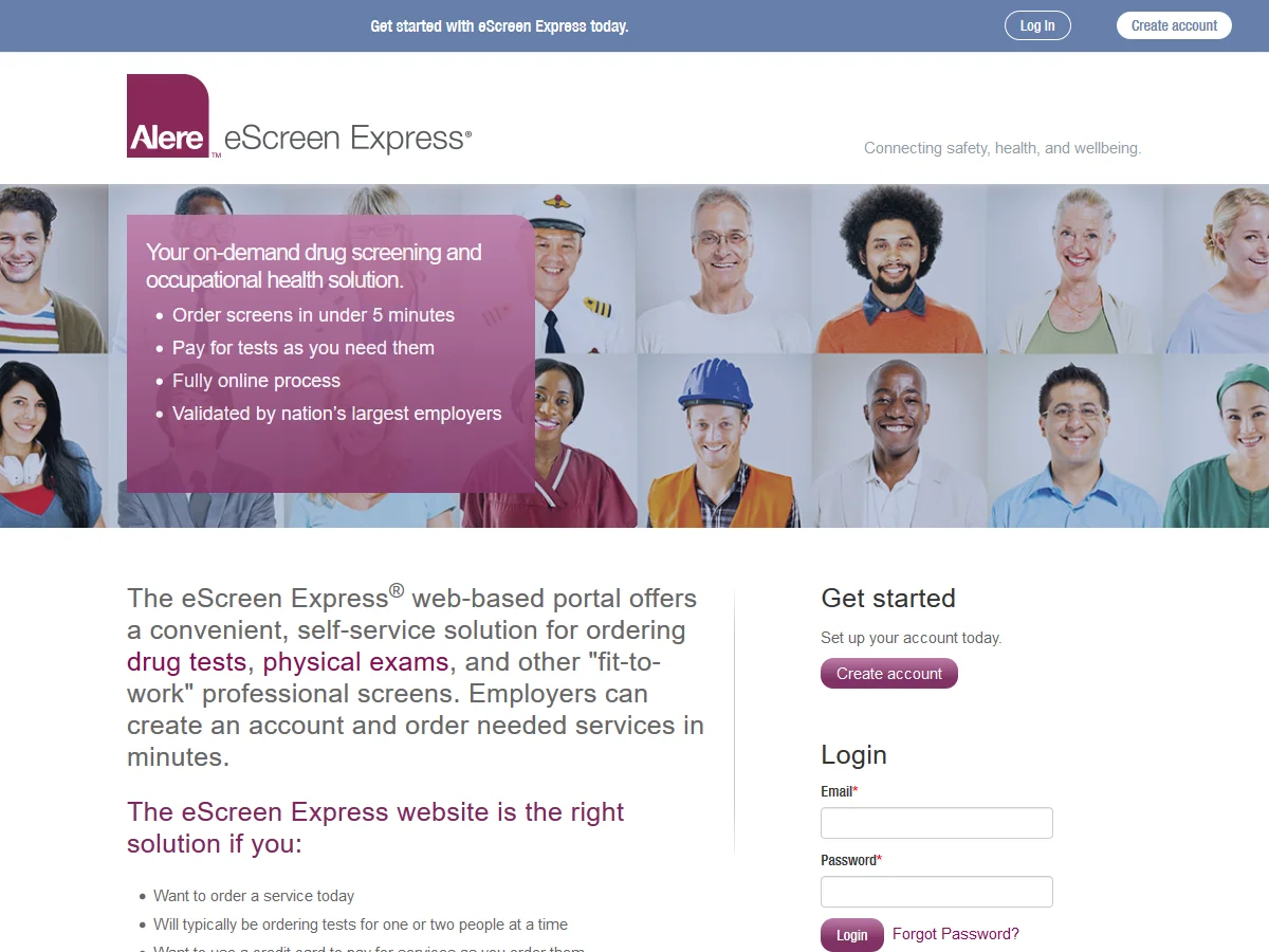
Website
eScreen.com
Problem:
When hired in 2008, the eScreen website was a static HTML site and starting to show its age. Navigational changes meant every page would need to be touched. The content had room for improvement, there wasn’t an easy way for visitors to communicate with us, and site traffic was mostly comprised of eScreen employees.
Senior management was intent on having a commercial website that lived up to the state-of-the-art technology eScreen was known for.
Details
March 2010
eScreen
Categories
Web | Digital
Solution:
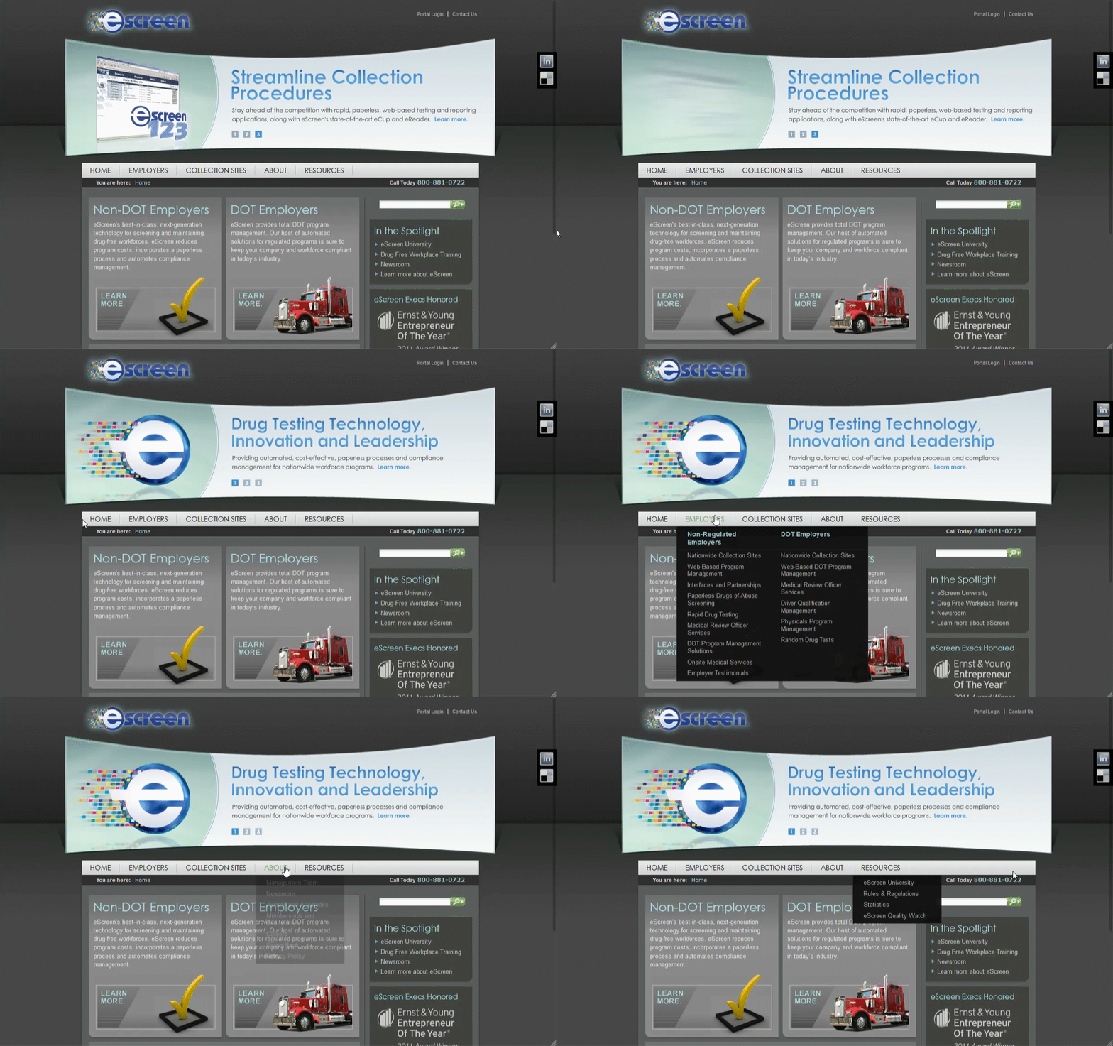
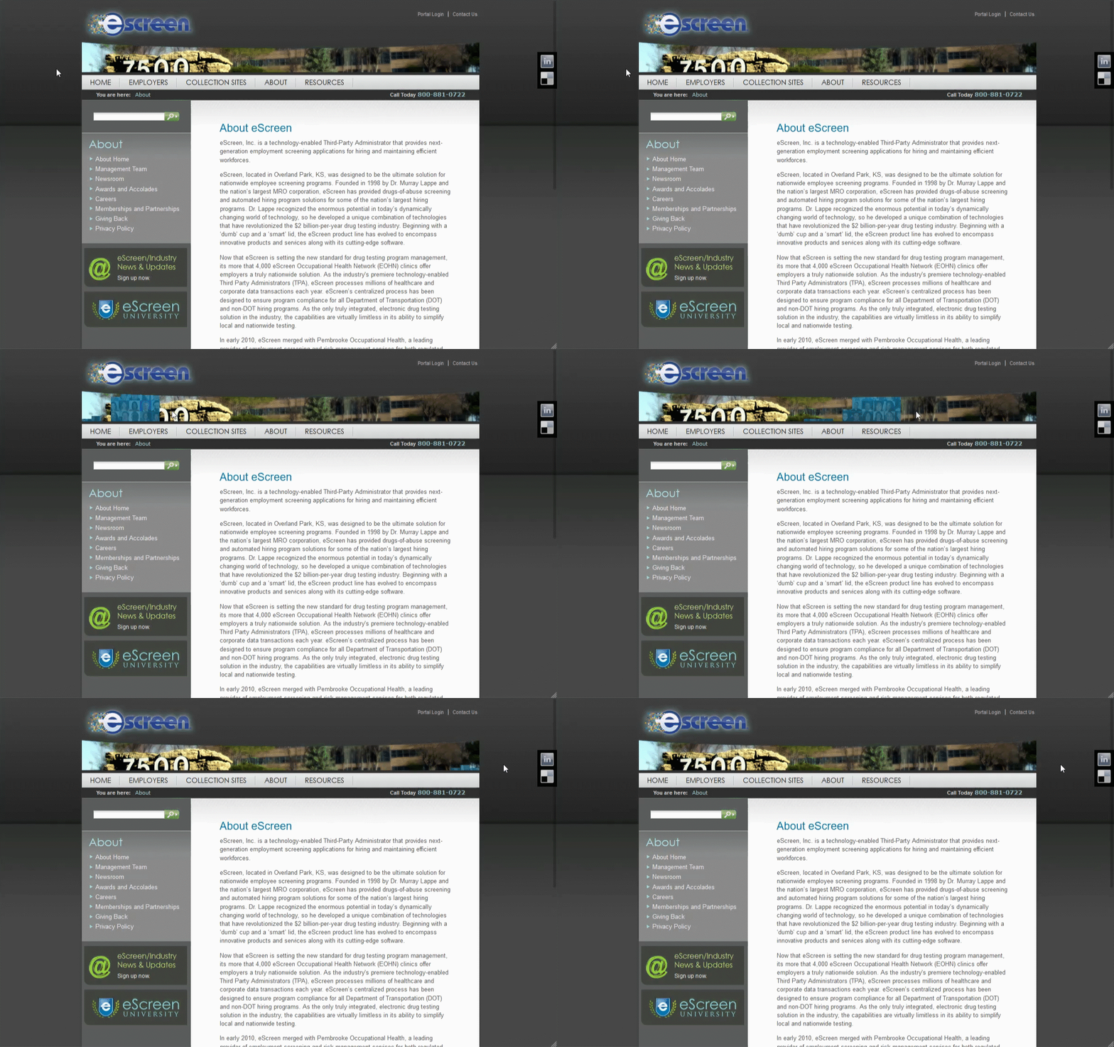
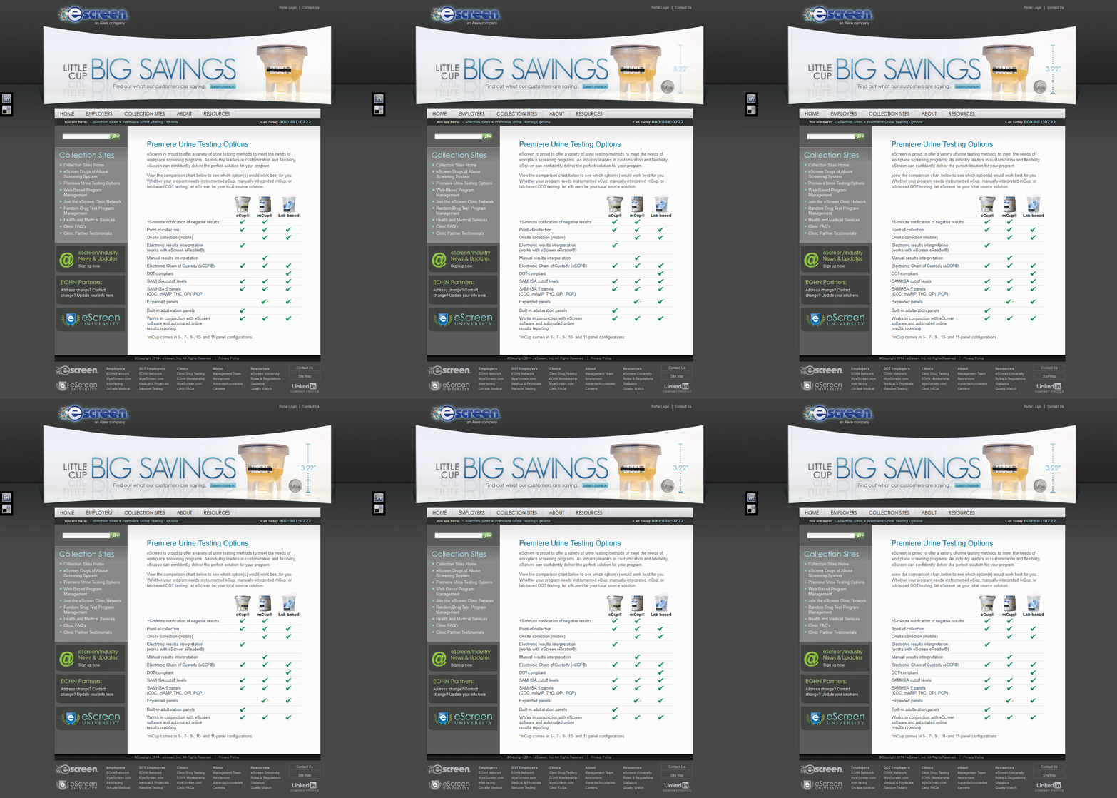
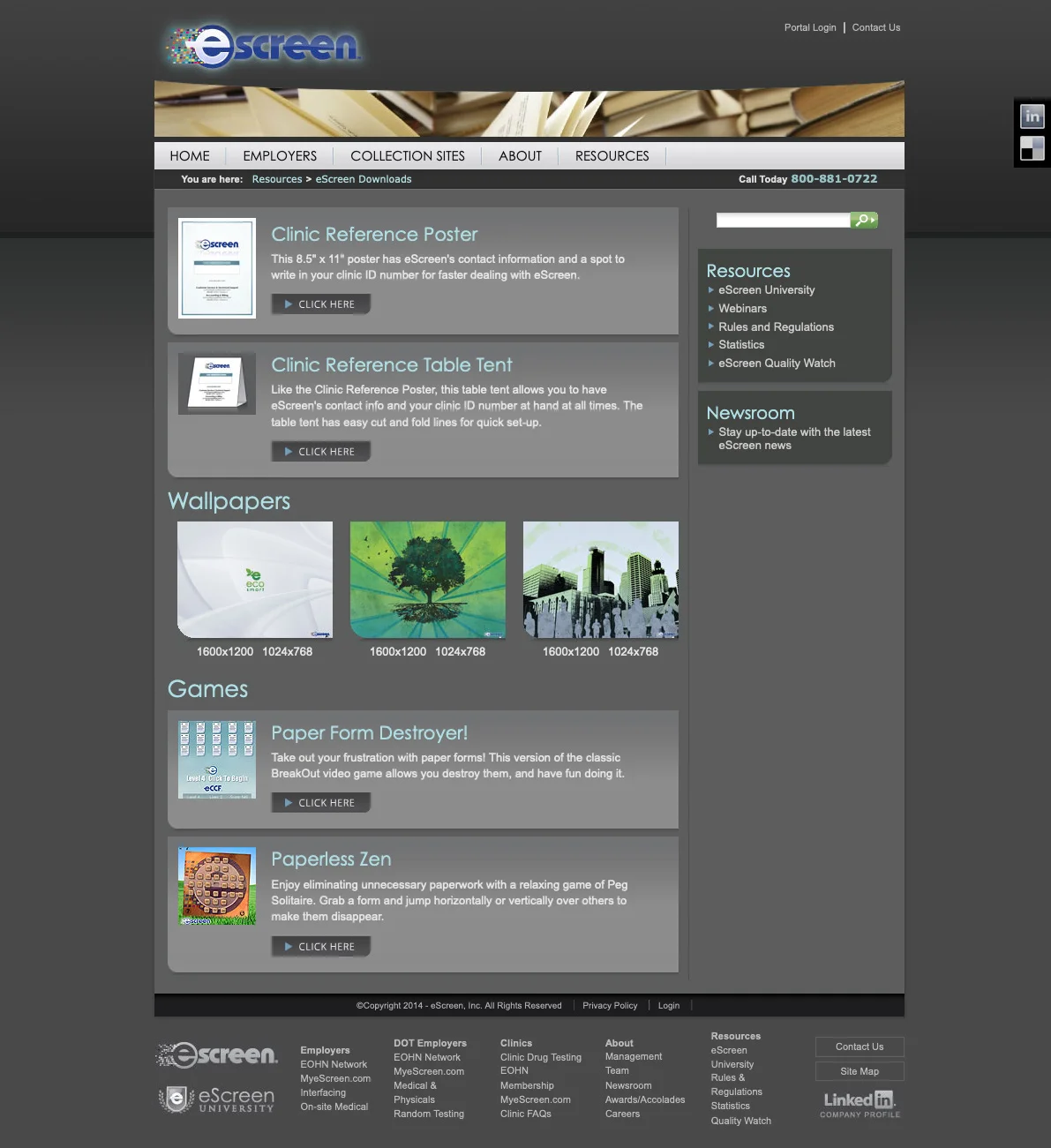
We tore it all down to start fresh—using best practices at every opportunity—and built a new site that looked better, performed better, and embodied the innovation for which we were known.
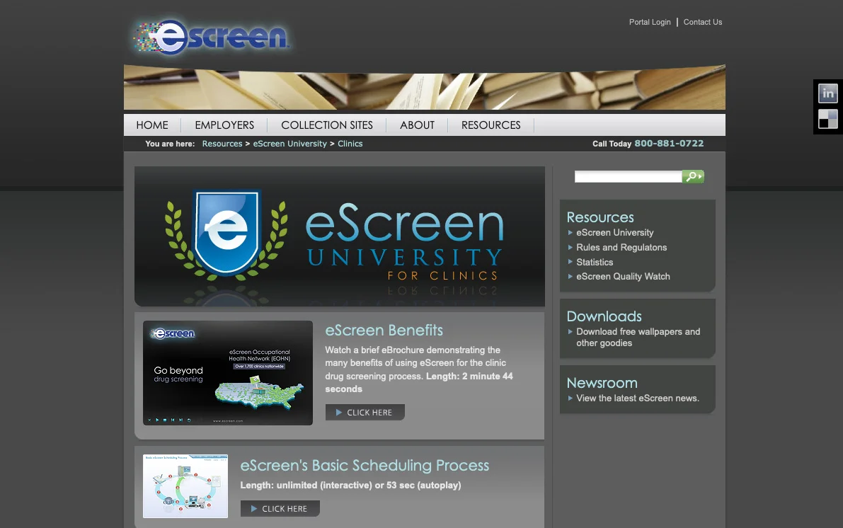
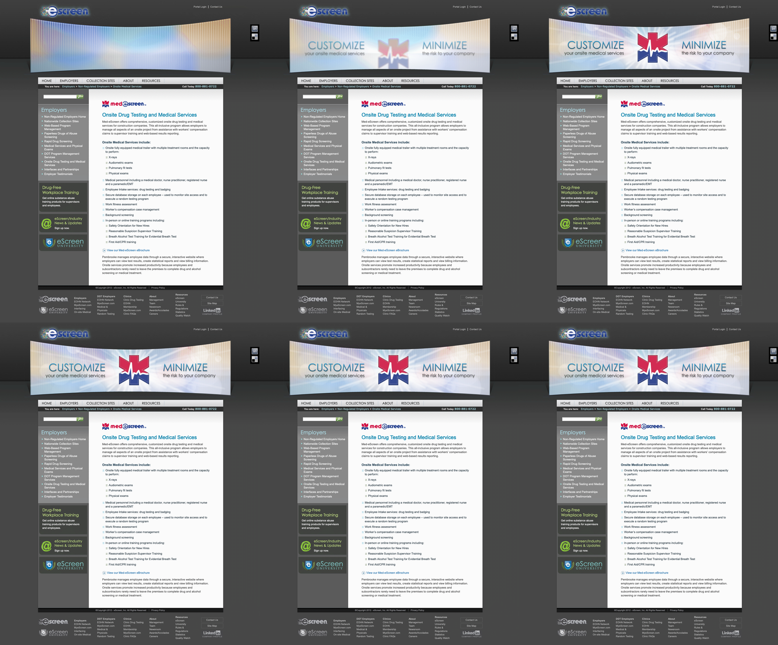
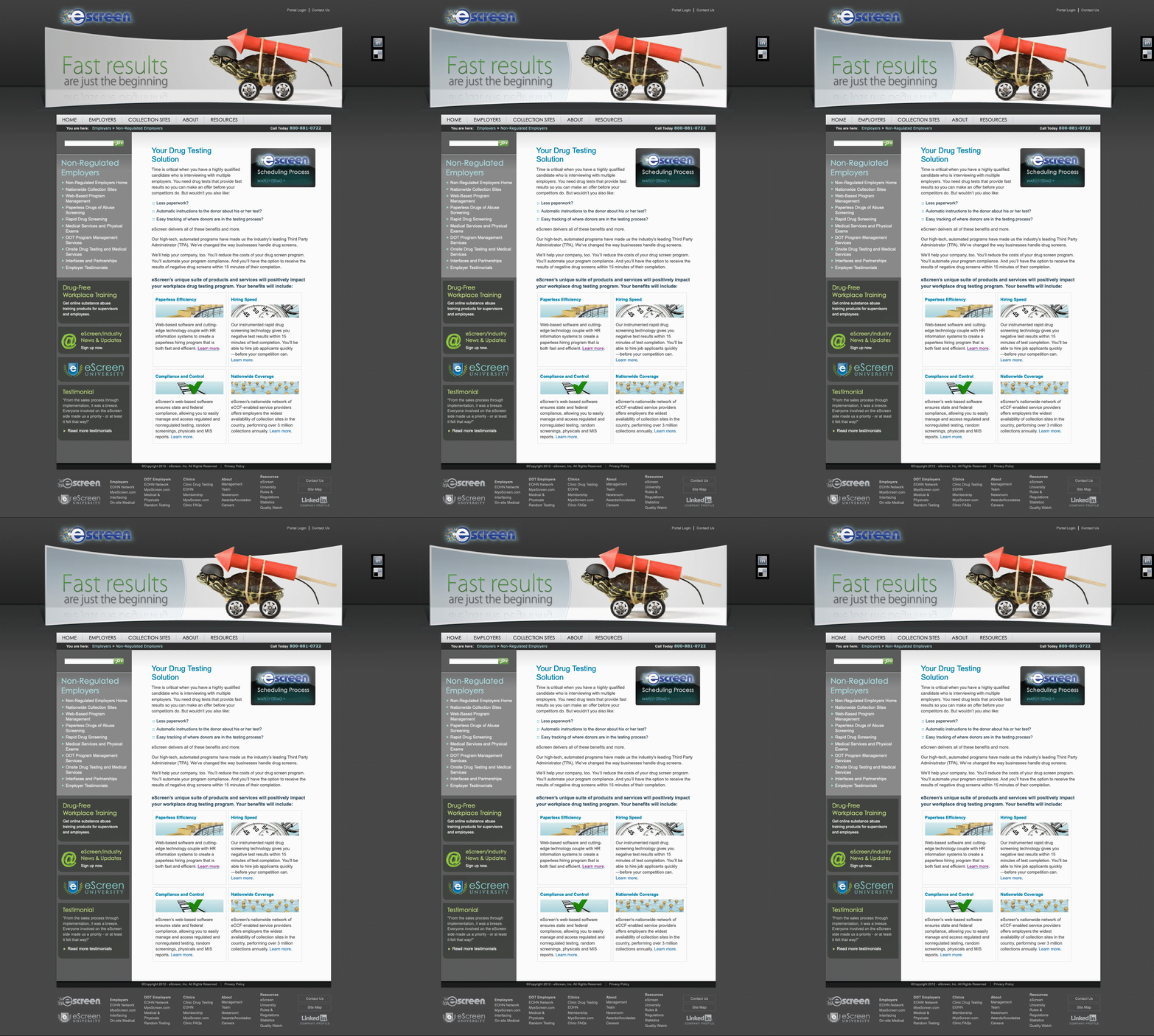
As a .Net shop, we leveraged DotNetNuke as our CMS. In mid-2010 we began overhauling the content, expanding it, improving readability, and optimizing it for SEO. I designed and built the front end and customized all modules and extensions. We added a library of compelling video assets, and facilitated customer engagement through live chat. Our new web forms used conditional logic to route inquiries and prospect submissions accordingly, and most importantly, effort on content management was vastly improved and more efficient.
We leveraged Google Analytics to measure and improve performance, seeing pronounced and consistent gains over the next five years. Not only were we getting more traffic, the visitors were staying on the site much longer.
%
Increase in Users First Year
%
Growth in Monthly Page Views after Five Years
%
Increased Monthly Traffic after Five Years
Execution:
A project this large required a comprehensive approach. Adobe applications played an indispensable role in the design, coding, and motion graphics of the new site. With prior experience with Joomla!, DotNetNuke was a quick learn. Google Analytics gave us the visibility we needed to create opportunities.

